
Scalable Branding Starts Here: Master Your Logo and Color Palette
If you’re ready to scale your brand, the foundation needs to be strong and intentional. It’s not just about designing a great logo or picking a few colors—it’s about creating a system that ensures your brand looks professional, consistent, and ready to grow.
Your logo and color palette are two of the most critical elements in building that foundation. They do more than make your business look good—they establish recognition, build trust, and set the tone for every interaction with your audience.
Here’s a breakdown of what you need to create a scalable brand: a logo that works anywhere and a color palette that speaks your brand’s language across all platforms. Let’s dive into these essential steps and make your branding future-proof.
1. Logo: The Face of Your Brand
Your logo is often the first thing people notice about your brand. It’s like the quarterback on your team—setting the tone for everything else.
Key Tips:
Keep it simple. A clean, recognizable logo is easier to remember.
Make it versatile. It should look good on everything from business cards to presentations to water bottles.
Reflect your business values. Use symbols or shapes that tie back to your industry or mission…or sometimes a cool design works best!
Pro Tip: Invest in a professional design if possible—it’s worth it.

Simple, clean logos are more modern and memorable.
Now Lock It Up
A great logo isn’t just about how it looks—it’s about how it works. A logo lockup ensures your logo stays consistent and professional in every context. A lockup is essentially a pre-designed arrangement of your logo’s elements—such as the icon, text, or tagline—that “locks” them in place. This prevents your logo from being stretched, smooshed, or altered.
Why You Need a Lockup:
Consistency Matters: It ensures your logo looks the same across all platforms and materials, from digital ads to embroidered shirts.
Avoid Mishaps: Without a lockup, resizing or manipulating your logo can distort its proportions, making it look unprofessional.
And Cover All Your Bases
Your logo will need to adapt to different applications and backgrounds. Having multiple lockup variations ensures it always looks sharp and legible.
Full-Color Version: For use on white or neutral backgrounds.
Black on White: Perfect for simple or monochromatic designs.
White on Black (Reverse): Ideal for dark backgrounds or high-contrast applications.
Transparent Background: For layering over images, graphics, or other designs.
Icon-Only Lockup: A simplified version (like just the logo symbol) for small spaces, such as social media profile pictures or favicons.
File Types You’ll Need
Different situations call for different file formats. Make sure you have these practical file types on hand:
EPS: A vector file ideal for printing and scaling without losing quality.
SVG: A web-friendly vector file for crisp visuals online.
PNG: Great for digital use, especially with transparent backgrounds.
JPEG: For everyday digital use, though it doesn’t support transparency.
PDF: Useful for sharing your logo with partners or vendors in a universally accessible format.
Pro Tip: Always keep your original vector files (EPS or SVG). These are essential for resizing and creating additional formats in the future.
2. Colors: Setting the Mood
Colors aren’t just pretty; they evoke emotions and send subliminal messages to your audience.
Key Tips:
Choose a primary color that represents your brand personality (e.g., blue = trust, red = passion, green = growth).
Add secondary colors for depth and variety in your visuals.
Use your brand colors consistently across all your materials to build recognition.
Pro Tip: Use tools like Adobe Color or Canva to create a cohesive color palette.
Be Specific…Be Very Specific
There are over 16 million digital color possibilities. Yes, 16 million!

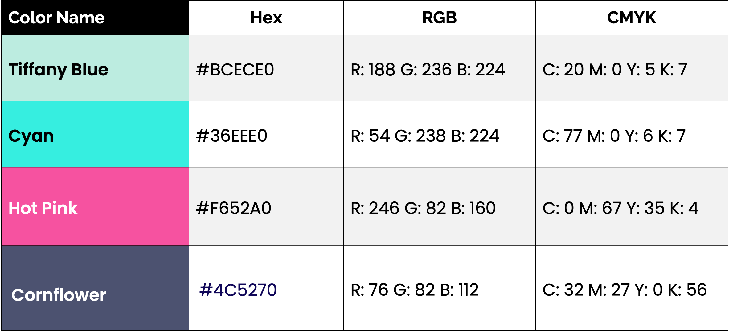
Just a small sample of the thousands of purple possibilities!
Digital colors are called hex codes. Hex codes are 6-digit universal codes that represent a digital color. These digital colors then correlate to an RGB code which is used for screens, and a CMYK code which is used for print.
Choosing and sticking to specific Hex, RGB, and CMYK values ensures your brand’s identity remains cohesive. Whether a customer visits your website, sees an ad, or picks up a printed flyer, they should instantly recognize your brand by its consistent colors.
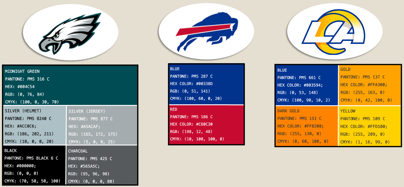
NFL teams each have color palettes with HEX, RGB and CMYK codes for their logos to ensure their teams are always represented consistently and on-brand.
Hex Codes (For Digital Use):
A Hex Code is a six-digit code (e.g., #3498db) that represents a specific color on digital screens.
Why It’s Important: Hex codes are used in website design, social media graphics, and other online applications to ensure your brand’s colors appear consistently.
RGB (For Screens):
RGB stands for Red, Green, and Blue—the color model used for anything viewed on screens.
Why It’s Important: RGB is the standard for digital designs, such as online ads, presentations, and videos. It ensures colors stay vibrant and true-to-brand across all devices.
CMYK (For Print):
CMYK stands for Cyan, Magenta, Yellow, and Black—the color model used for printed materials like brochures, business cards, and packaging.
Why It’s Important: Colors in print don’t always look the same as on screen. Using CMYK ensures your printed materials match your brand colors as closely as possible.
By speaking the "language of color," you’ll ensure your brand stands out and stays consistent, no matter where it’s seen.
Now The Fun Part
Consistency is key when it comes to your brand colors, and that starts with choosing the right Hex, RGB, and CMYK codes. Follow these simple steps to lock down your brand colors and ensure they stay consistent across all platforms.
1. Start by Picking Hex Codes
The Hex Code is the foundation of your color palette, especially for digital use. Here’s how to pick yours:
Use a Color Tool: Platforms like Adobe Color, Coolors, or Canva are great for exploring color palettes and combinations.
Choose a Primary Color: Pick a color that reflects your brand personality (e.g., blue for trust, red for passion, green for growth).
Add Secondary Colors: Select 2–3 complementary colors that enhance your primary color and provide variety in your branding materials.
CTA Accent Color: You’ll want to choose at least 1 color that pops to use as your primary call-to-action to draw your visitor’s eye on your website and other digital assets.
Example: If your primary color is a soft blue, you might choose light gray and dark navy as your secondary colors.

Adobe Color gives you an array of options on how to put together a color palette with colors that work well together in various ways.
2. Find the Corresponding RGB and CMYK Codes
Once you have your Hex Codes, convert them to RGB (for digital) and CMYK (for print):
I like this converter from HTMLColorCode.com which gives you all three plus HTML/CSS if needed for your website backend.
https://htmlcolorcodes.com/hex-to-rgb/
Tip: Other tools, like Canva Pro or Adobe Creative Suite, also show you all three codes (Hex, RGB, CMYK) at once, or you can look up RGB and CMYK free converters separately.
3. Document Your Codes
Once you’ve locked in your Hex, RGB, and CMYK values, it’s crucial to document them for consistent use across your brand.
Create a Brand Style Guide: Include a dedicated section for your colors, listing the exact codes for each shade (primary and secondary).
Share With Your Team: Make the guide accessible to anyone designing or using colors within your brand—designers, marketers, web developers, and printers.
Use Swatches in Design Software: Save your colors as swatches in tools like Adobe Illustrator or Photoshop so they’re always ready for use.
Hex, RGB and CMYK codes can all be converted to one another easily with free online converter tools.
Why This Process Matters
When your colors are consistent across digital and print, they reinforce your brand identity. Customers will recognize your materials immediately, building trust and familiarity over time.
Your logo and color palette aren’t just design elements—they’re strategic assets that help you scale your brand with confidence. By setting up these essentials now, you’re laying the groundwork for a cohesive, professional brand that grows with your business.
Pro Tip: Revisit your color palette periodically to ensure it aligns with your evolving brand, but always keep the documented codes up to date. With a solid foundation, your colors will remain a powerful tool for branding success.
Need help with your branding? Check out our packages for Establishing your Foundation and let’s create a strong, consistent brand that stands out. Reach out for a consultation today!